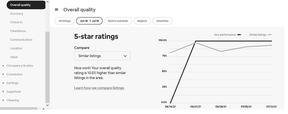
Does anyone understand this ABB graph?

Branka-and-Silvia0
Level 10
Zagreb, Croatia

Does anyone understand this ABB graph?

I am really confused with Airbnb Performance graph.


From June 14-21. I didn't have guests, didn't get any reviews so it's 0 % for the first week.

From June 21- July 12. I have a 100% of 5* ratings.


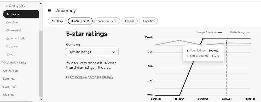
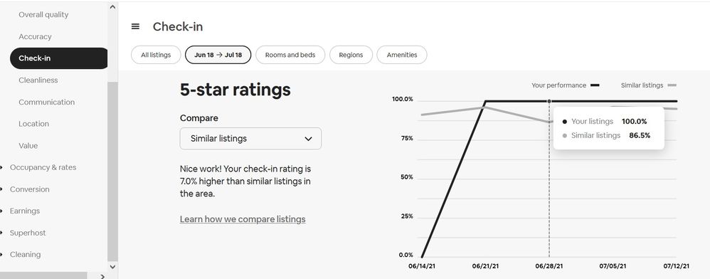
But.... if I compare to similar listings in my area Airbnb is telling me I am higher or lower than others.

How can a 100% of 5* can be lower than others?


For example OVERALL RATING - I have 100% 5* so I am 10,5% higher than others. OK.


aaa1.jpg


But then here is ACCURACY ... I have a 100% of 5* so how can I be 8% lower than others?


aaa4.jpg


Then, here is CHECK-IN... I am higher than others...


aaa3.jpg


Am I missing something? And where could I find my rating breakdown and see what rating I got for each category from each guest? I have no idea where Airbnb hides it now ...


Thank you


14 Replies 14
Emiel1
Level 10
Leeuwarden, The Netherlands

@Branka-and-Silvia0 

 I never look at reviews or ratings from guests.

Maybe the best thing to do also.

@Emiel1  I don't look ratings either, that's why I don't know where to find them :)))


But yesterday. I noticed my studio has the best rating, my 2 Bdr has lower and the 3 Bdr (third listing where guests can book both units as one)  has the lowest rating. It's interesting, bc everything, including the price, is the same as if you book both of them separately.  So I tried to see the ratings and to understand what's the problem.


Ann72
Level 10
New York, NY

@Branka-and-Silvia0  I've been trying to understand those graphs for a long time.  On the one hand, they seem transparent; on the other, contradictory, as you've noted.


Under "accuracy," it looks like someone gave less than five stars in the week of June 14th, which is why the note says 8% lower.  But you didn't have any guests that week.  Did you have any checkouts on the 21st or 22nd?


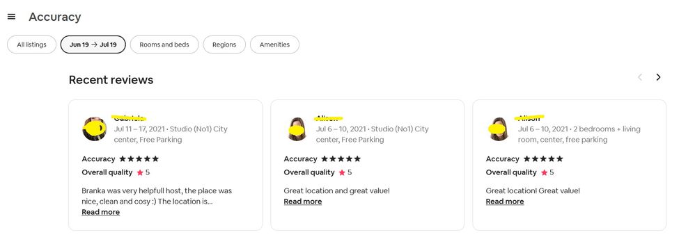
To see each category's stars, scroll down below the graphs and you'll see "recent reviews," under which the rating for the category you're currently in will show first.  For example, in the screenshot below, the "value" star rating is shown first, over the overall rating:


Screen Shot 2021-07-18 at 9.05.40 PM.png


Can you believe this chick gave a 3 for value, after she didn't read anything and couldn't BELIEVE they had to drive 10 miles to town?  Oh, you can?  LOL.  Plus, in the review and in the private feedback she said she wanted to come back.  


um-i-dont-think-so.jpg

 " To see each category's stars see "recent reviews," under which the rating for the category you're currently in will show first. .." 

@Ann72  thank you, I would never think of that...   WOW!.. who came up with this brilliant, practical idea of showing statistics? 😄 😄  LOL


Anyway, you were right, one guest was staying from Jun 18-20 and gave me 4* for accuracy weeks ago. Maybe that's it.

MAYBE.

Because now, a day later I have a new mystery! 

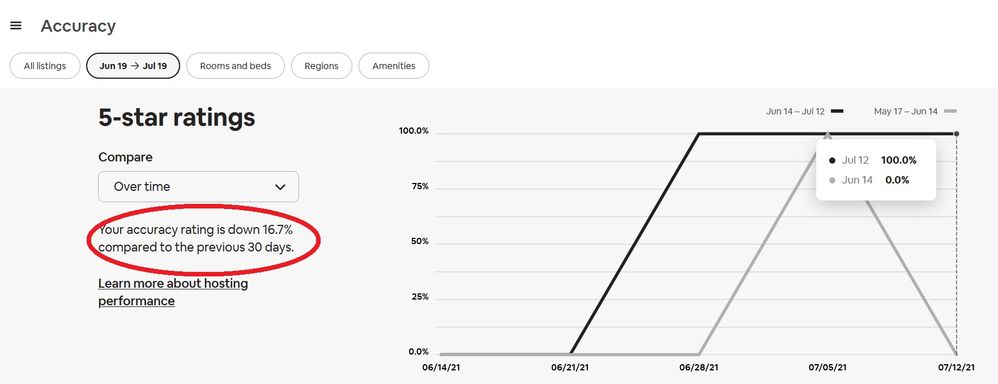
Today, my accuracy rating dropped again... after I got a 5* accuracy review yesterday. 

Is Airbnb kidding us or what? 😄

Of course, the graph is still showing a 100% of 5*... and the period from Jun 14 - July 12 even though the period in the upper left corner and statistics are for the period from Jun 19 - July 19  


aaa5.jpg


aaa6.jpg


Recent guests here not only drove 10 miles (15K) to town, @Ann72 , but when they got there, at 5:10 pm, the beer store was closed! The beer store hours are listed on the internet, but who reads that? I gave them two bottles from our fridge, but it was not their brand, so it was awfully noble of them to accept and drink them. 

When hosts are so heartless as to offer quiet and privacy in ridiculously rural places, they deserve the star-bashing they get. My guests took stars from location and overall, then, like yours, wrote a cheery "We will be back!"

Aw, grumpy cat, you know what's what. 

@Branka-and-Silvia0 , the graphs make my head hurt. My one competitor has quit hosting, delisted as the pandemic struck, and so I'm the only game in town. My ratings are 3% higher than other imaginary Florence hosts. Perhaps the brands of beer they keep in their fridges is worse.


😅😁@Lawrene0 


OK , my mistake...  this is "over time" graph and yesterday I was looking at "similar listings" graph


anyway... it is just showing how confusing this statistic is displayed. A few years ago it was simple and understandable for everyone.

Robin4
Level 10
Mount Barker, Australia

@Branka-and-Silvia0 


I don't know where you are actually finding this information, I can't seem to find it anywhere on my site.....which by the look of it is just as well. The last thing I need is to be confused by yet more of Airbnb's 'Mumbo Jumbo'!


Cheers........Rob

Laura2592
Level 10
Frederick, MD

@Branka-and-Silvia0  I find all of those graphs totally useless, especially as there are not that many "similar listings" in my market. I ignore them TBH. Maybe ABB should do a survey of hosts to see how many actually use these tools. Might be eye opening. 

Branka-and-Silvia0
Level 10
Zagreb, Croatia

@Robin4you didn't miss anything, trust me :)))

But I find it from the dashboard/performance/quality...

If you can't find it then it may be the part of "professional tools" option


@Laura2592I am sure it would be used much more if it would be simple. As it used to be a few years ago.


@Branka-and-Silvia0 

Ah, that explains why I can't find it. I used to have 'Performance' on my Dashboard but that disappeared along with 'Home' about 3 months ago. I don't have performance any more....I now have 'insights'...... and performance and quality do not get a Guernsey under insights....or anywhere else on my dashboard!
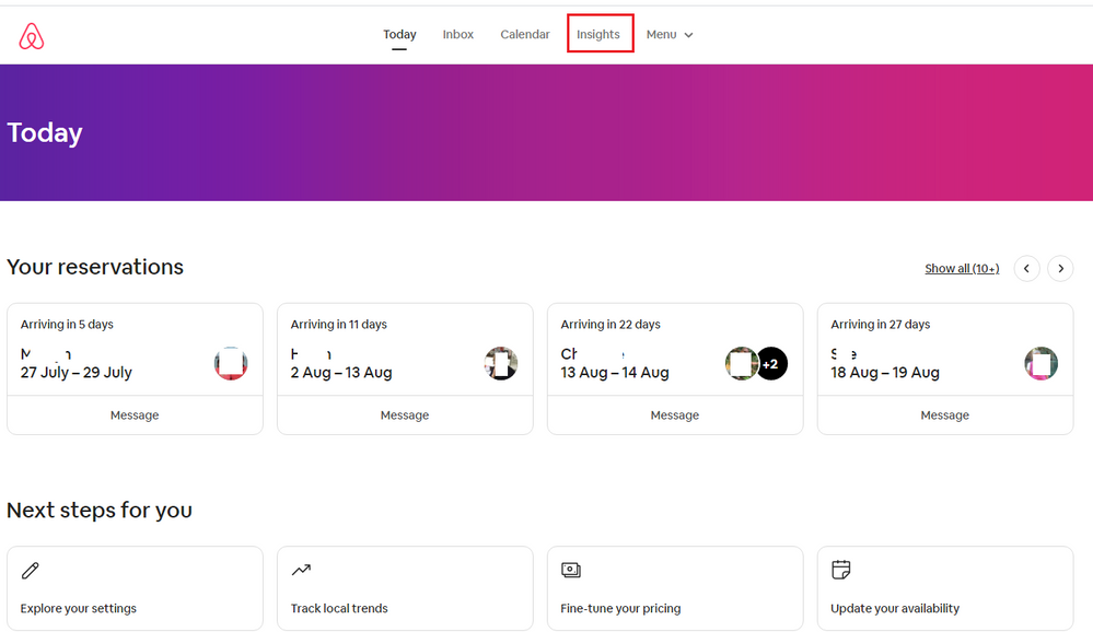
Dashboard.png


Simple when you think about it though, my performance has been so good and my quality is so outstanding that Airbnb obviously felt I no longer need any guidance with any more stupid graphs....Hahahahahaha


It is interesting that, dependent on where we are in the world we all seem to work with different versions of the site.


It could be under Professional tools Branka, but being a simple fellow I have never bothered about professional help. Where Airbnb is concerned I have looked on professional tools as being an extension,  another sightly more sophisticated way of tempting me, and helping me, to lose money, so I have deliberately given them a wide berth!

And from the look of those graphs, that is probably not far off the point....that is precisely the sort of information I would expect to see under professional tools!  Something that makes me look stupid and Airbnb look smart!!!

I would lay a bet not even the person that designed those graphs knows what they mean, you can make figures do and say anything. But in the end it all boils down to 'b*ms in beds' and money in the bank, and I haven't found the need for professional graphs and tools to achieve that! 


Cheers.......Rob
@Robin4  yes, you don't need it bc you have just one unit. But for anyone with 2 or more units, multi-calendar and rule sets are very helpful and I use them all the time.

OK.. rule sets could be more user-friendly bc now we have to scroll and click 18 times to apply just 1 ruleset and I wrote a post about it 2 years ago

https://community.withairbnb.com/t5/Help/RULE-SET-FRUSTRATIONS/m-p/1037016 and now Is even worse. They added bubbles that appear when I select a date and they are on my way when I want to select multiple days. It is sooo frustrating, I feel like I am trying to catch a fish with bare hands but it slips away. The bubbles are impossible to turn off and are always with the same useless text ( xx xx, 2021 is a popular date More travelers are searching for stays ... blah blah...)


33.png


Airbnb obviously doesn't care how we will clean our properties with carpal tunnel syndrome we got from clicking


Branka-and-Silvia0
Level 10
Zagreb, Croatia

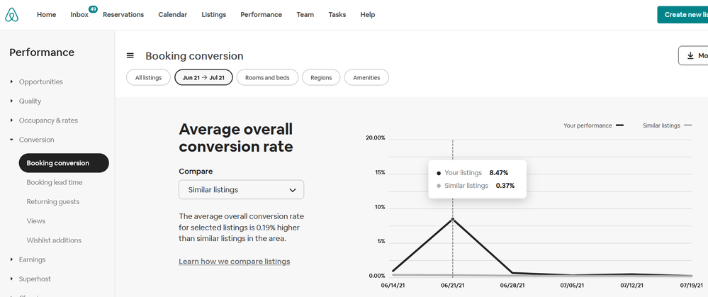
And what is "Conversion rate" ???


Bez naslova.png


And "Booking lead time" ?

Do I need this info?


@Branka-and-Silvia0  I've struggled with the "performance" graph. Mine (and yours) goes up and down like mountain peaks to sea level. The only problem with that is that it seems like the AirBnB concept is that you plummet to "zero" when you're not getting a guest rating, except that you are not booked, so no rating is coming in. It may just be a problem with the graph illustration, but really? 


Your rating is for when guests are in residence. You don't plummet to 0% quality when nobody is staying. I've tried to wrap my head around it, but then I just gave up. Not even worthy of a screenshot. The statistics appear to be correct, but the graph doesn't. Somebody please set me straight if I'm being an idiot here. 


** I think conversion rate is the percentage of people who look and then ultimately book. I really don't pay much attention. I just take the bookings as they roll in, and don't really do any extra marketing or social media posting to attract more bookings.